CVS
Launching CVS Kidney Care nationally
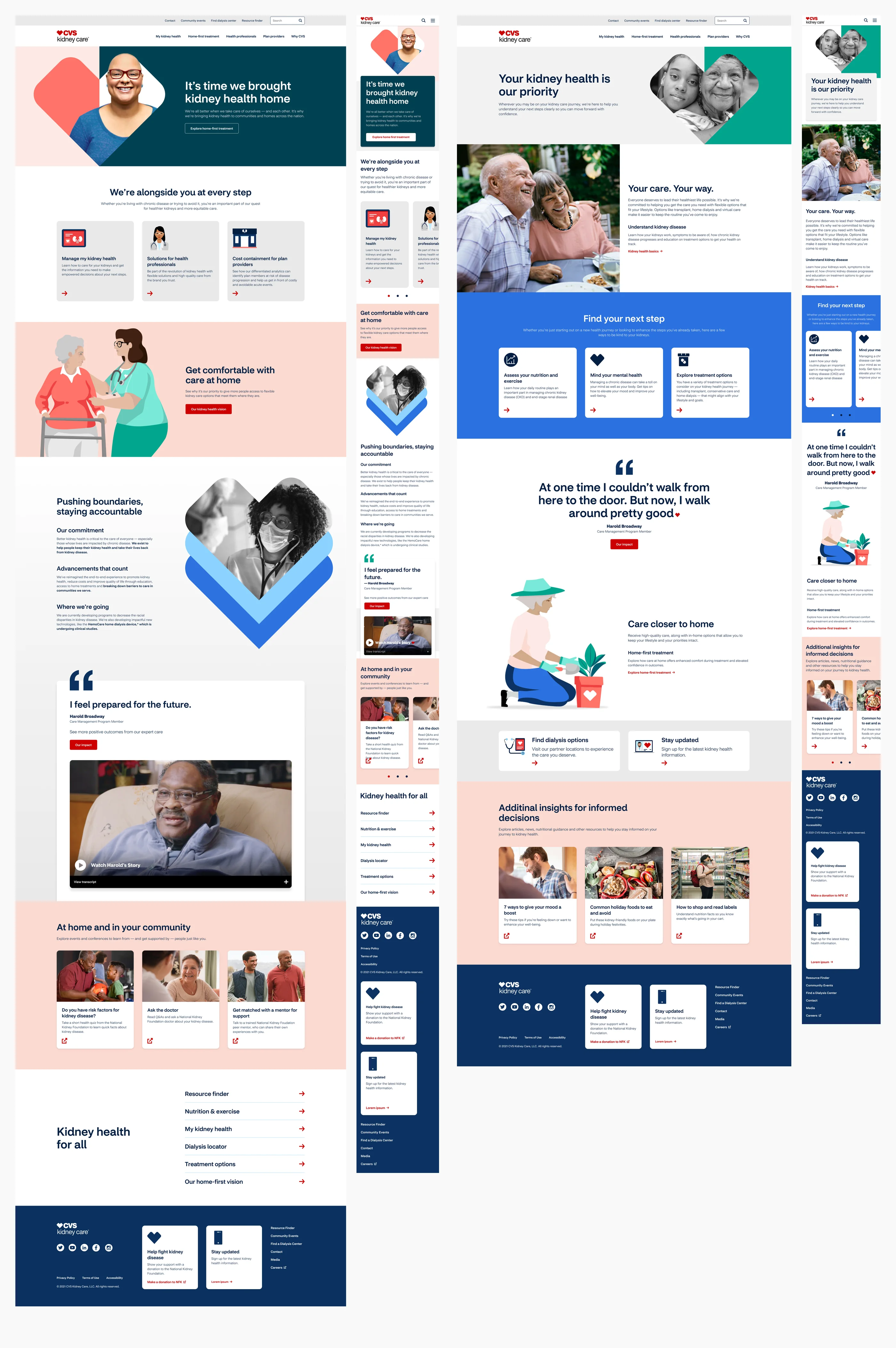
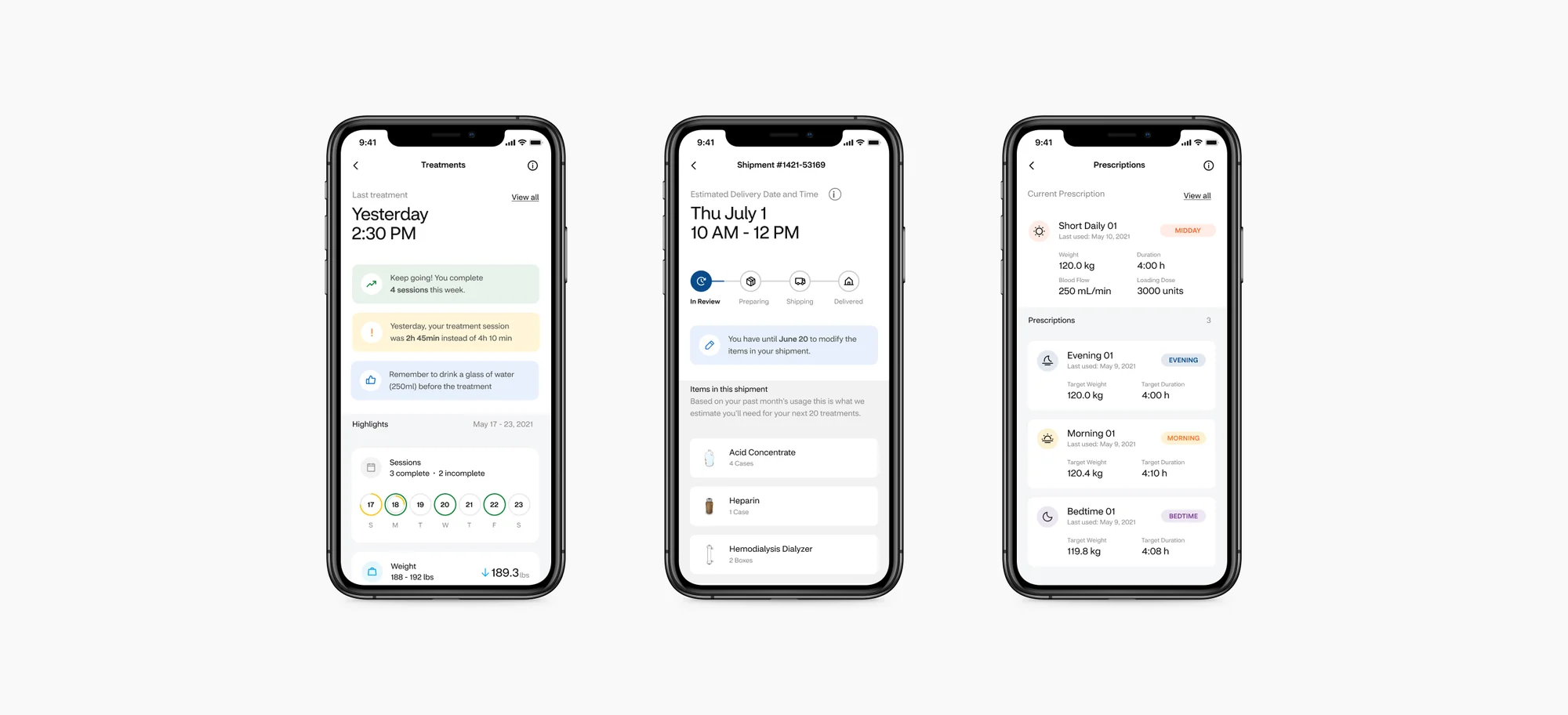
A national campaign website for CVS Kidney Care, built from reusable sections, plus a patient app for treatments and supply shipments.
- Role
- Product DesignUX ResearchDesign System
- Skills
Prototype
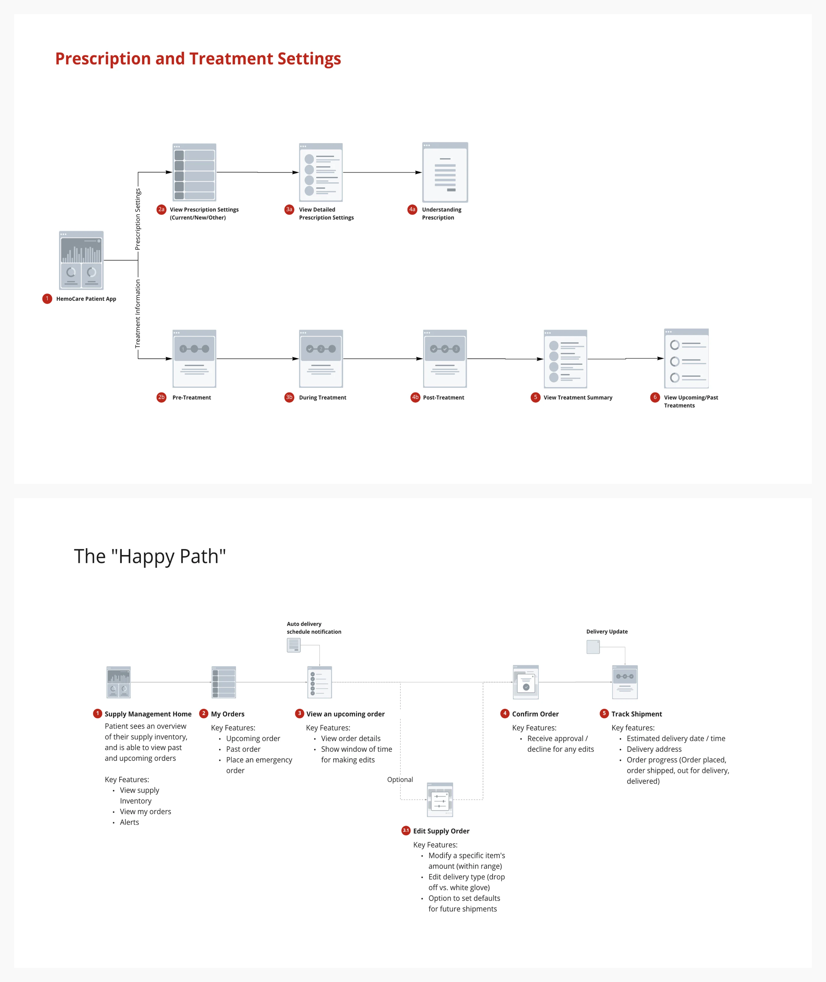
I made an end-to-end flow of the entire experience; this was the best way to get feedback from the team and also present to the stakeholders.
Below is a clickable prototype for Treatments & Supply Management:
Overview
After the website was complete I needed new scenarios and a completely different user flow. The following needs of the users below:
If the patient doesn’t agree with a new prescription - is the clinician revising that same prescription triggering a notification to the patient that an update has been made for them to re-review - or is the clinician deleting and replacing that prescription? If a prescription is deleted does the patient need to be notified?
Do prescriptions expire? What does that process look like?
What does the process look like for “Contact Clinician”? How is the contact defined? What is the contact method?
Do prescriptions always have a designation of morning, midday, evening, or bedtime - or does the clinician ever leave that value blank?
Overview
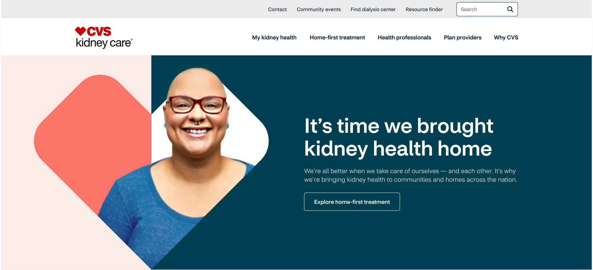
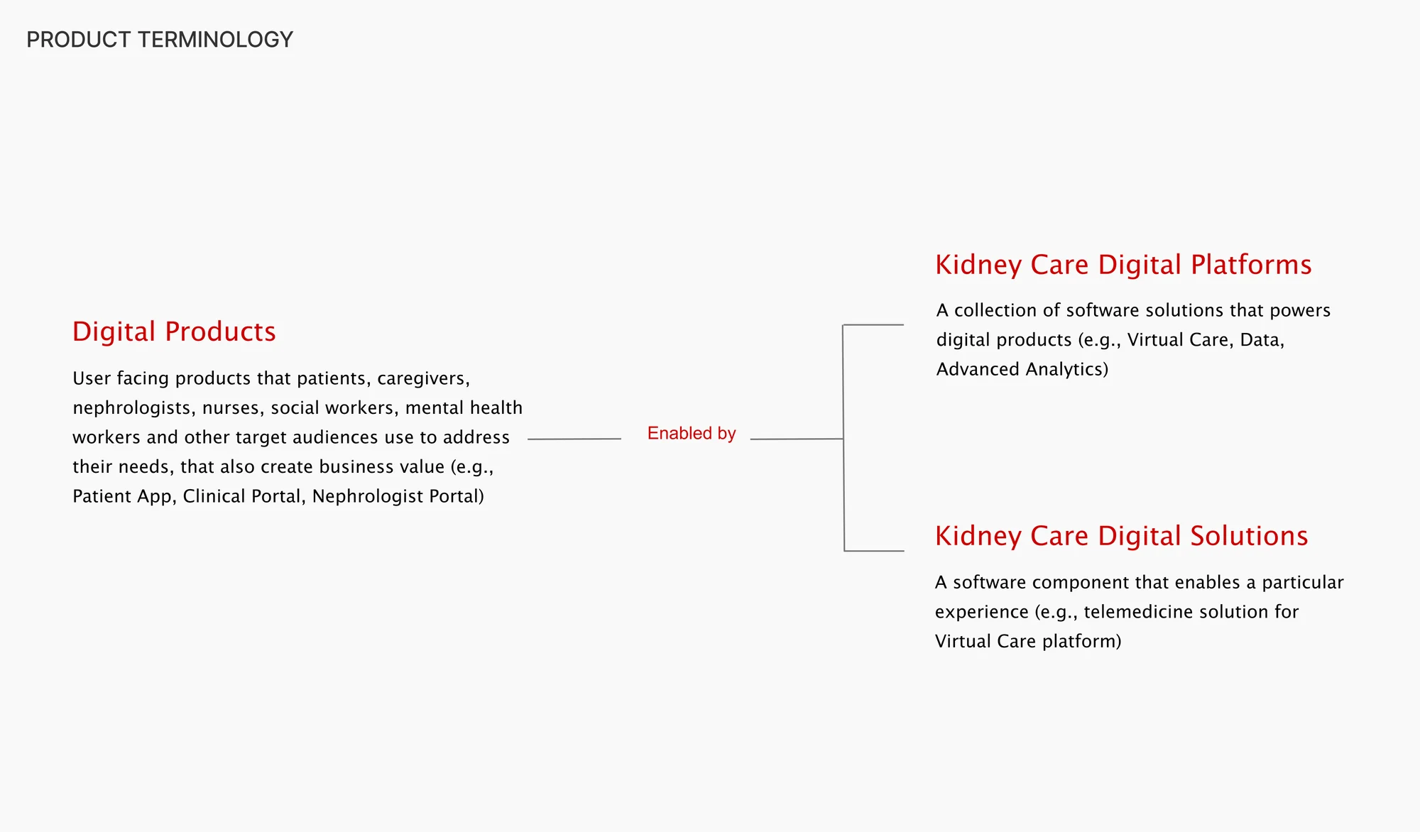
CVS Kidney Care intersects with broader CVS Enterprise in a number of areas that ladder up to the overall purpose and mission. We needed to reimagine how to address chronic conditions for Americans everywhere, starting with Kidney health. With a mandate to transform the industry by setting a digital benchmark, we needed to create a human-centered patient experience that delivers holistic kidney care where, when and how our patients need it most.
Research & Planning
We need to bring clear and compelling ideas that drive awareness with our key audiences. Create buzz for the media and excitement for employees and build a strong digital foundation for the brand to launch. This starts with National Kidney Month, but must have legs to live beyond.
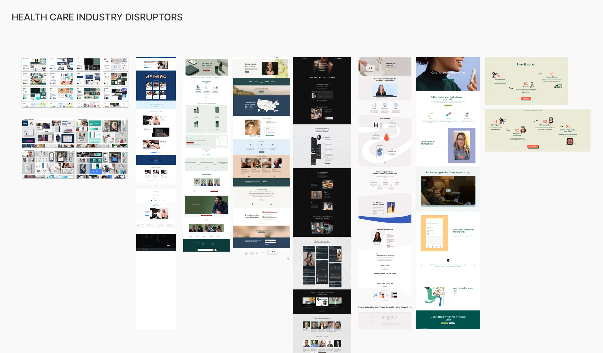
Our persona was set but we needed to compare our collections with the industry standards, and annotate on the current healthcare disruptors. Setting up a moodboard and defining the visuals we wanted to achieve was an important part of the process.
Define Strategy
Our first step was to create the funnel that will lead into the kidney care patient portal, which was a 2.0 website that had an updated experience and aligned with the new visual language. This was an important piece because it was the first customer facing experience that the patients will face.
This will directly roll into the Kidney Care digital products such as:
- New and improved patient portal
- iOS patient app HemoCare
Ideate
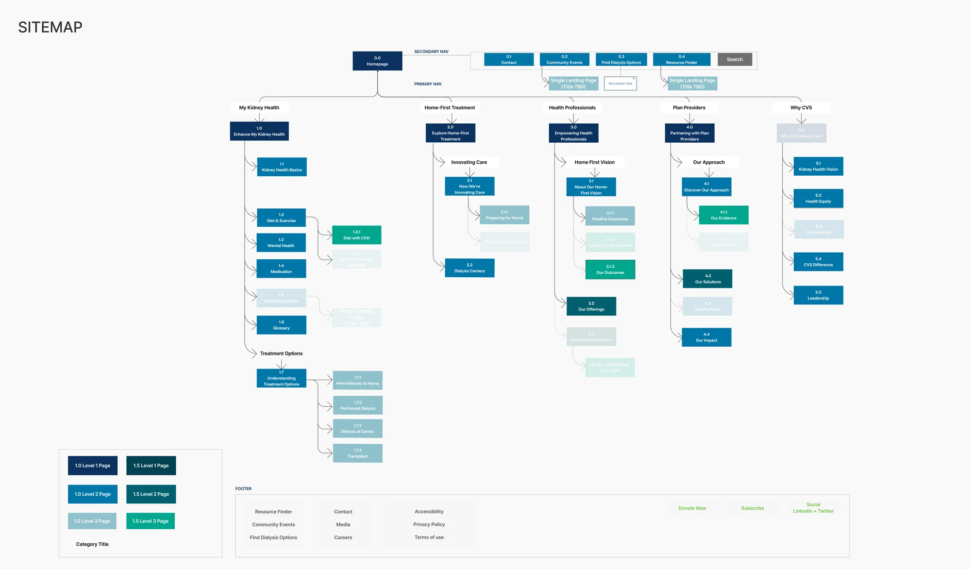
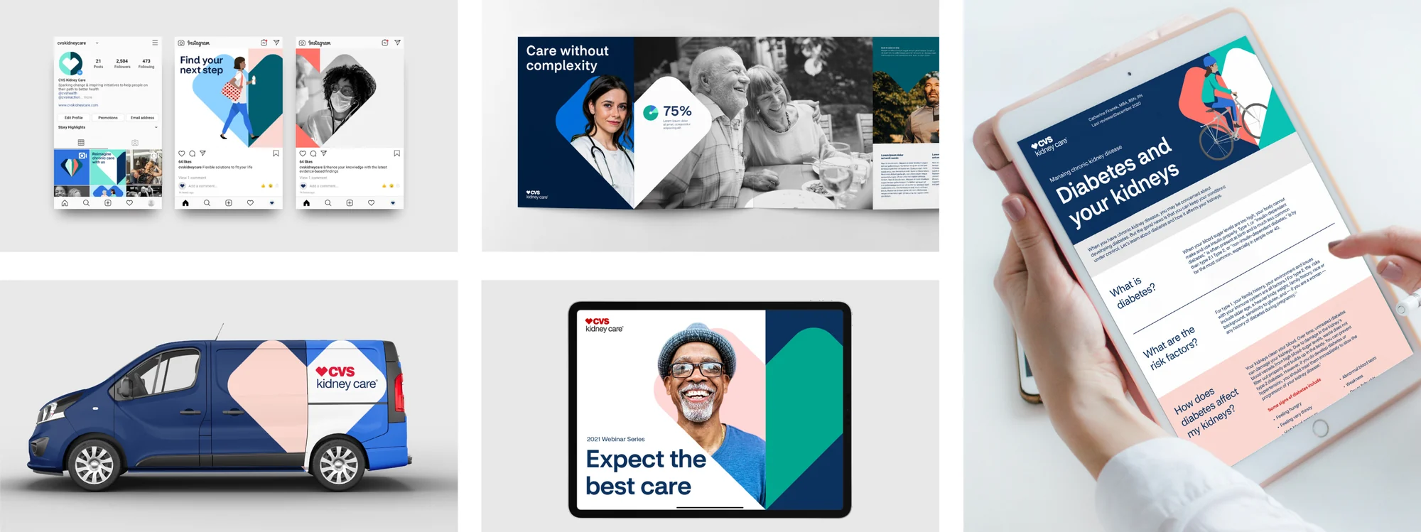
After the initial roadmap was in place I started creating fragmented implementations of the web experience. In order to do this I had to bring the brand visuals and implement it into the website.
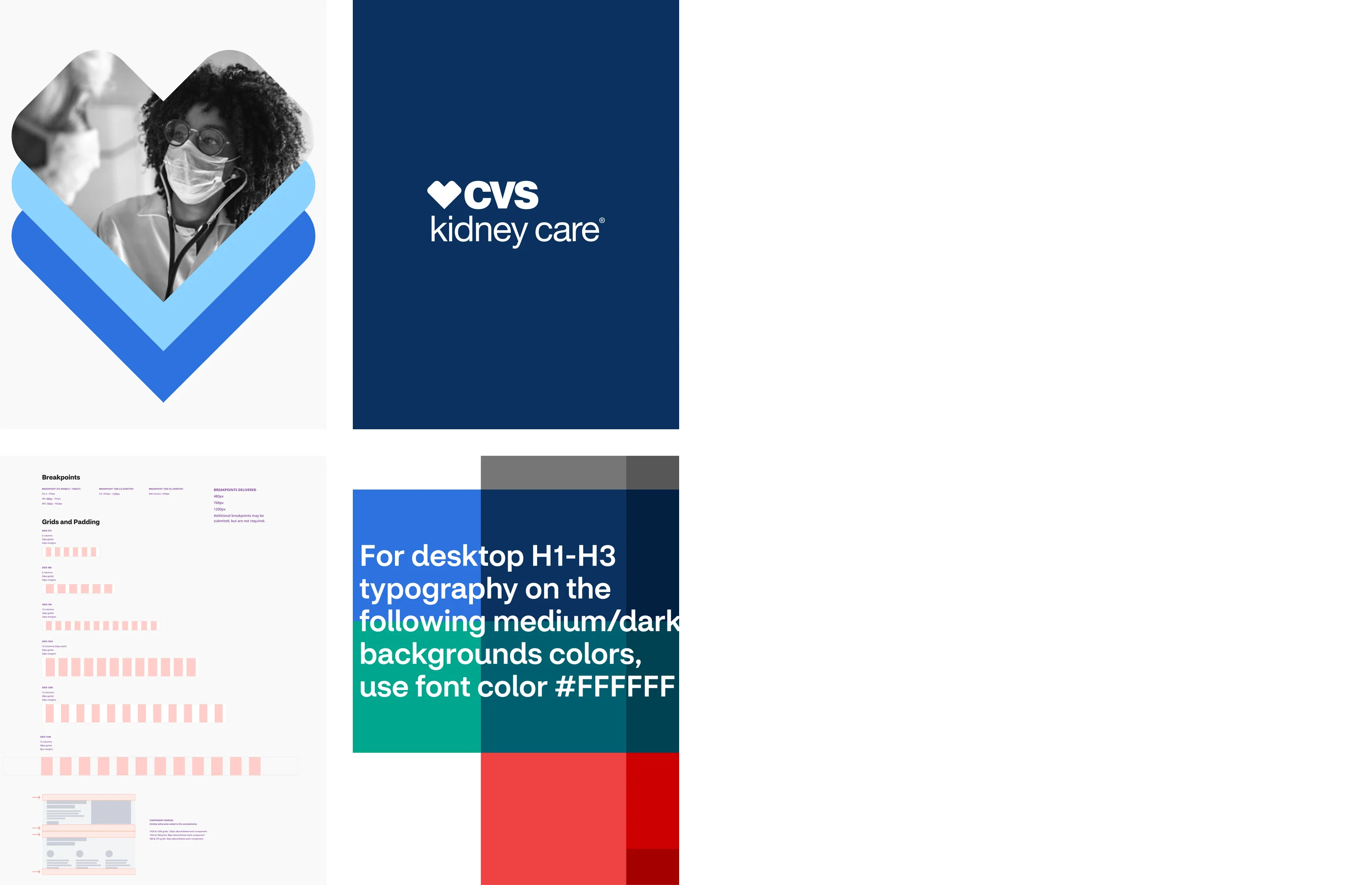
Scalable Sections
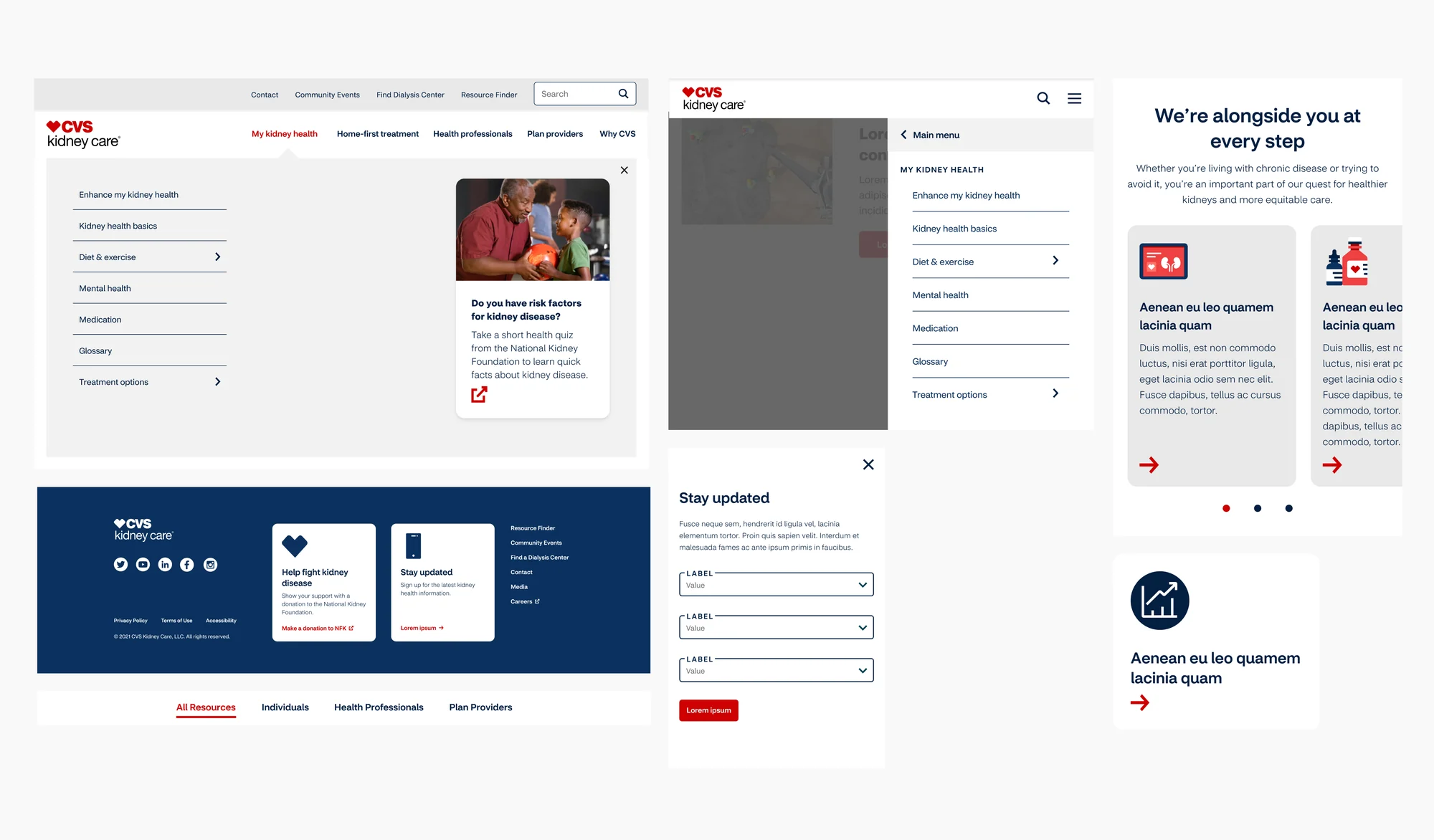
Once the sitemap and brand visuals were aligned, I built section components that could be placed to make the home page and the category page. These sections would also be the building blocks for all the other pages on the website.
- Megamenu
- Header / Footer
- Text Box + Resource Module
- Search
- Media Asset Gallery
- Carousel
- Forms
- Modal
- Breadcrumbs
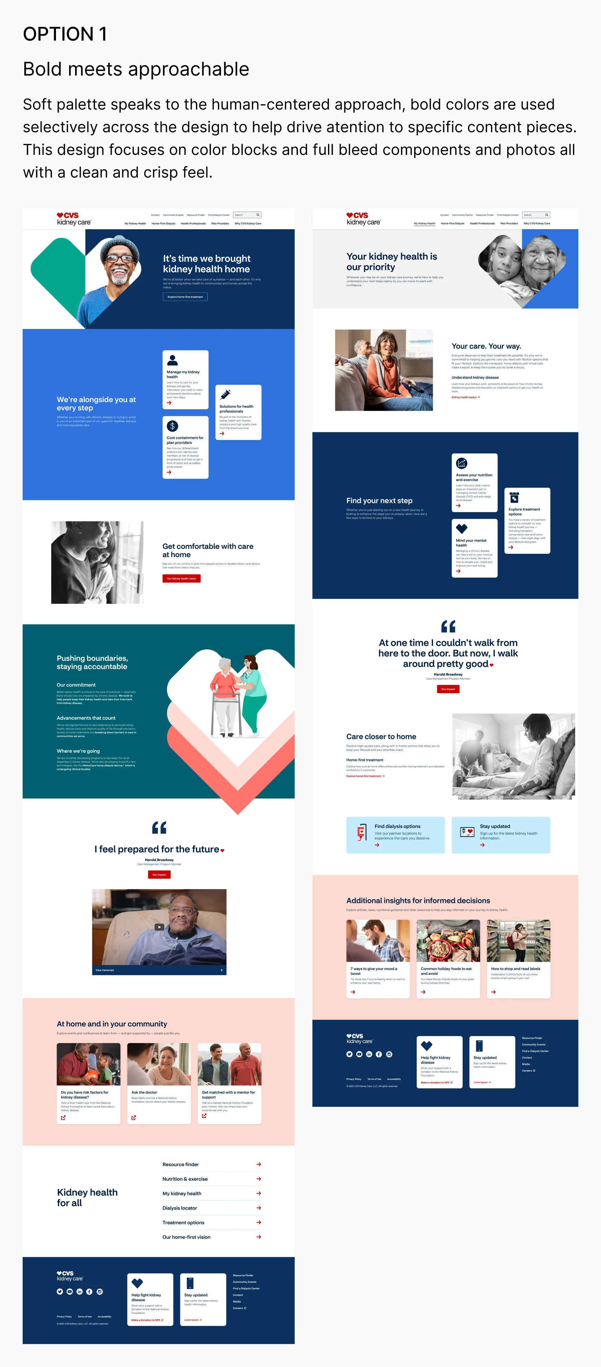
Design Round 1
The building blocks were set and now I could test multiple iterations of the website. I conducted 3 rounds of iterations to find the correct solution.
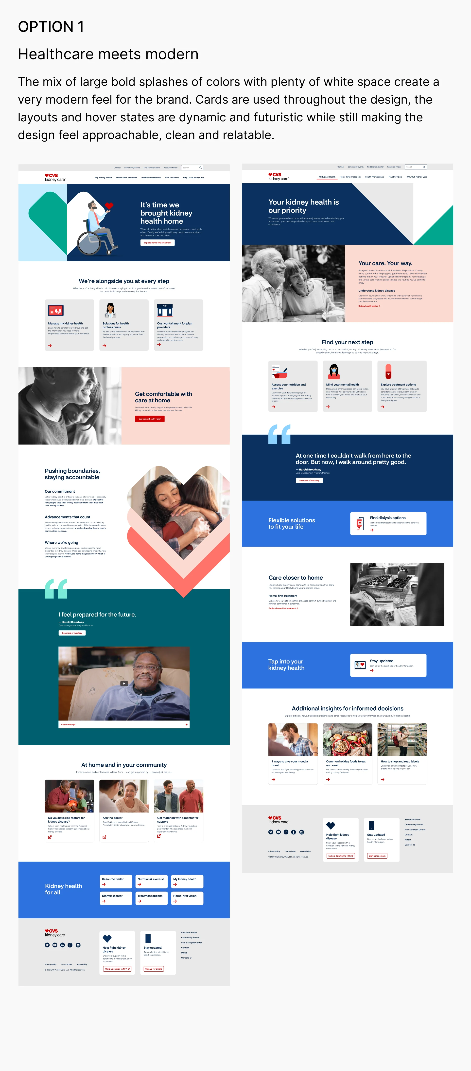
Design Round 2
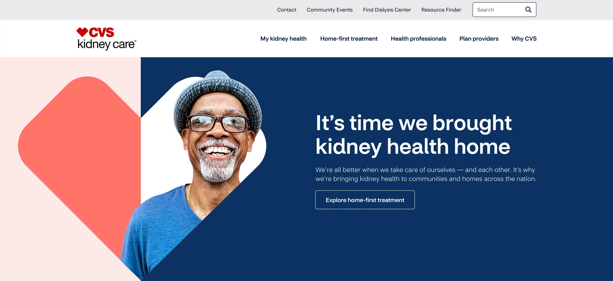
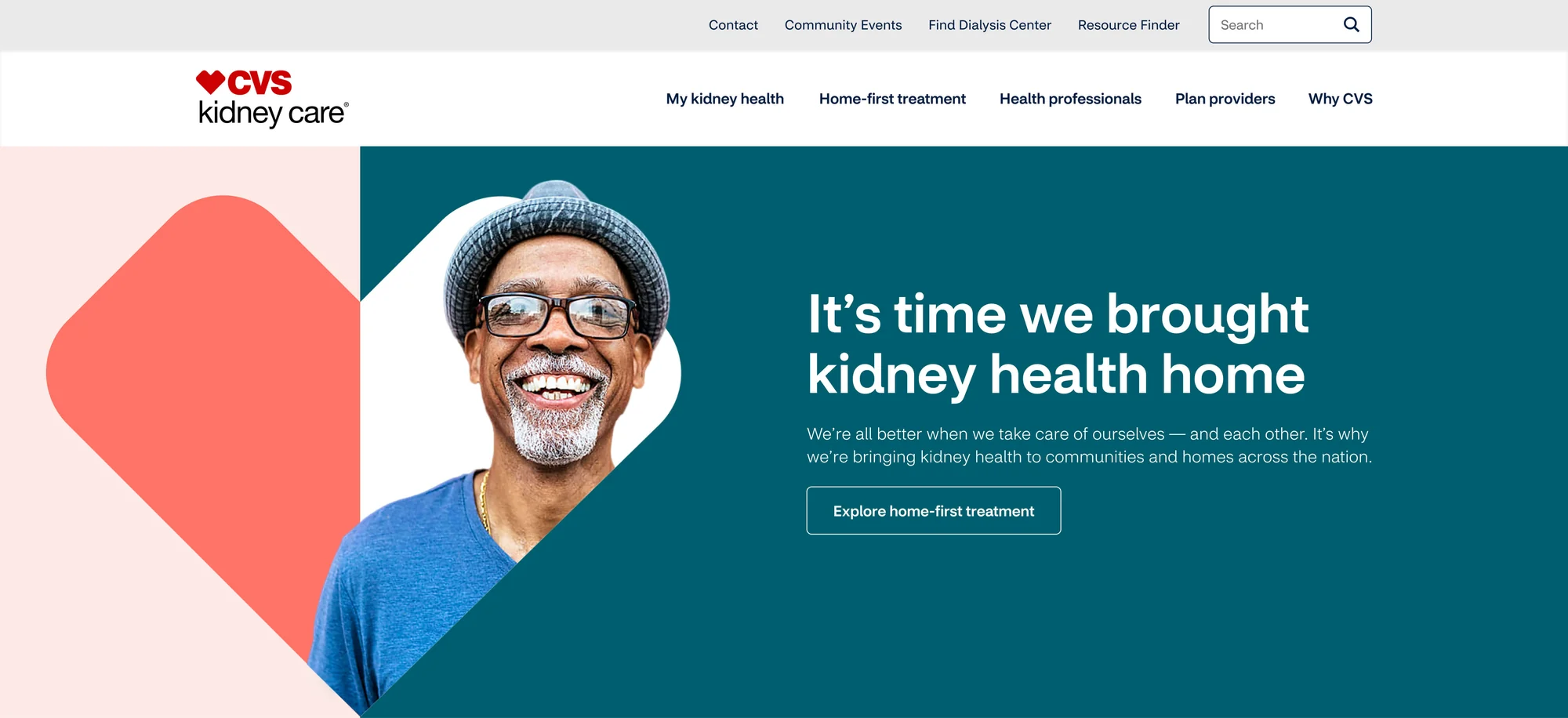
I combined the two to create “Approachable meets modern”. Only revisions needed were picking between blue and teal.
Final Design
It came down to two design concepts that would be the benchmark of CVS Kidney Care and this would roll into the second phase of design for the dashboard experience as well.